
How To Add Legends To the Chart Itself In Excel; Smart way to show legends in chart
- Dp

- May 8, 2019
- 1 min read
Updated: May 16, 2019
In this tutorial, I will show you an interesting trick in Excel on How To Add Direct Legends To the Chart Itself.
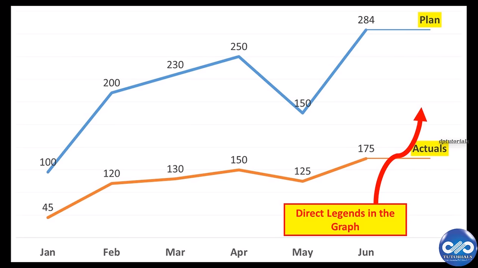
In this example, let us consider the data range as shown consisting of Plan and actuals for 6 months.

Step 1: Let us plot the chart from the quick analysis tool like this.

Step 2: The normal line chart will be generated like this

Step 3: Now, let us enter the values of last column into a new column, which will be an extra column now.

Step 4: Click on the chart and extend the data range to include the new column as well, so that it gets captured into the chart like shown below.

Step 5: Now right click on the new column's cell and click on Format cells and set the format as custom and type "Plan"
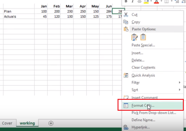

Step 6: Similarly, format the 2nd cell of new column and type it as "Actuals"

Step 7: Observe that the cells contain the numeric values but displaying as text which we have formatted in step 5&6.

Step 8: Now right click on the chart and select to add Data Labels, as shown.

Step 9: Finally, format as per your convenience and the final chart should like this showing the legend in the chart itself.
Watch this video tutorial for better understanding:
If you liked this tutorial, share it with your friends. And also you can follow us on Youtube, Twitter and Facebook. We would love to hear from you, Please do comment, suggest or compliment our work and we shall make it better for you. You can write us at dptutorials15@gmail.com


Comments