How to Highlight MAX and MIN Values in MS Excel Chart
- Dp

- May 15, 2018
- 2 min read
Updated: May 26, 2018
In this tutorial, let us learn how to highlight special data points in the Chart that we create in MS Excel.

Let's see how to do it now:
Step 1:
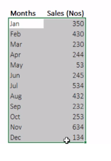
In this example, I am considering the data of Sales in numbers by month wise in a particular year.

Step 2:
If we generate the Chart with the available data in two columns, it would be like as shown below:
now let us highlight the MAX and MIN Data points in this chart

Step 3:
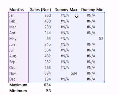
Let us first Calculate the MAX and MIN values of these figures at the bottom of the table, using the formulas as shown:
MAX function in C16 = MAX(C4:C15)
MIN function in C17 = MIN(C4:C15)

Step 4:
Now let us create two dummy series in two columns as "Dummy MAX Series" and "Dummy MIN Series"
Enter the formula in the Dummy Max series column's first cell as = If(C4=C16,C4,NA()), this will give the result if the cell's value is the max of the series, or else it will show as NA. Similarly enter the formula in the Dummy Min series as = If(C4=C17,C4,NA()). With these dummy series, you will able to see the Max and Min values only in the particular months

Step 5:
Now click on the chart that we have created, and select the entire data along with the Dummy series this time.(as shown)

Step 6:
And when the chart gets updated, you can click on the chart type in the menu bar under "Design" tab and select the type of chart as "Line with Markers" (as shown)

Step 7:
Now, as a final step, you can play with colors and do all the cosmetic formatting for making good reports. this is a sample one.

Here is the detail Video Tutorial for better understanding:
If you liked this tutorial, share it with your friends. And also you can follow us on Youtube, Twitter and Facebook. We would love to hear from you, Please do comment, suggest or compliment our work and we shall make it better for you.
You can write us at dptutorials15@gmail.com


Comments